Components
- Accordion
- Alert
- Alert Dialog
- Aspect Ratio
- Avatar
- Badge
- Breadcrumb
- Button
- Button Group
- Calendar
- Card
- Carousel
- Chart
- Checkbox
- Collapsible
- Combobox
- Command
- Context Menu
- Data Table
- Date Picker
- Dialog
- Direction
- Drawer
- Dropdown Menu
- Empty
- Field
- Hover Card
- Input
- Input Group
- Input OTP
- Item
- Kbd
- Label
- Menubar
- Native Select
- Navigation Menu
- Pagination
- Popover
- Progress
- Radio Group
- Resizable
- Scroll Area
- Select
- Separator
- Sheet
- Sidebar
- Skeleton
- Slider
- Sonner
- Spinner
- Switch
- Table
- Tabs
- Textarea
- Toast
- Toggle
- Toggle Group
- Tooltip
- Typography
Get Started
April 2024 - Lift Mode
A new mode for Blocks to lift smaller components for copy and paste.
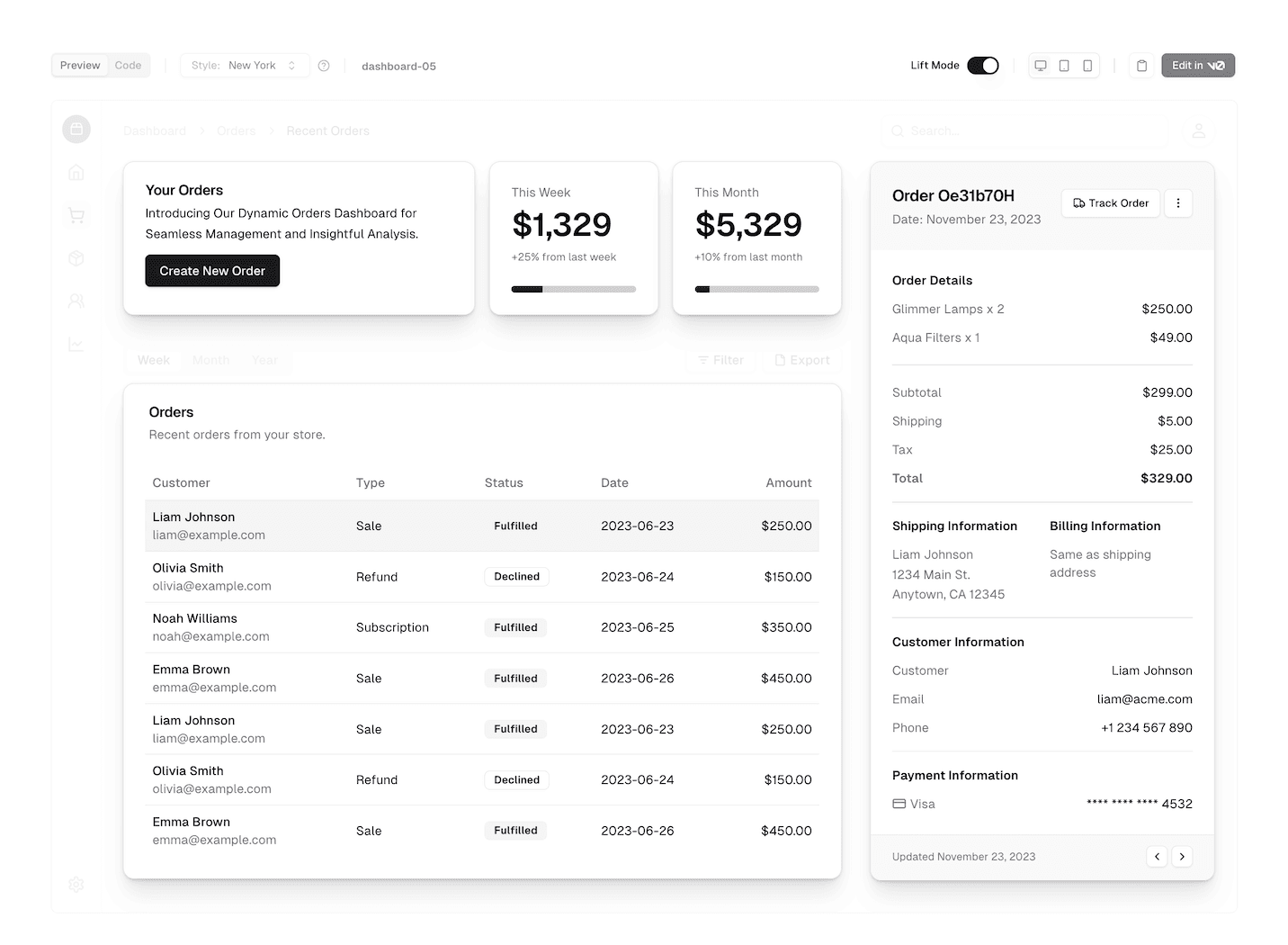
We're introducing a new mode for Blocks called Lift Mode.
Enable Lift Mode to automatically "lift" smaller components from a block template for copy and paste.

View the blocks library
With Lift Mode, you'll be able to copy the smaller components that make up a block template, like cards, buttons, and forms, and paste them directly into your project.
Visit the Blocks page to try it out.
Deploy your StyleDriven UI app on Vercel
Trusted by OpenAI, Sonos, Adobe, and more.
Vercel provides tools and infrastructure to deploy apps and features at scale.
Deploy to Vercel